☆ graphic ☆
univers
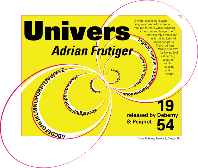
The poster of this typeface was designed to show both the personality and possible usage. I displayed the entire alphabet, both in capitals and undercase letters. The rings in the image were difficult to do at first. I learned how to then create a group from the original set to copy for a contrasting effect. I also learned that I had to create a third copy for the "type on a path" tool within the program.
Made in Adobe Illustrator.
nathan fielder

I created a poster for the comedian, Nathan Fielder, from the show "Nathan For You". At first, I struggled with the magic wand tool and the blending options for the pictures. It was hard for me to use the magic wand tool around the individual strands of hair without deleting that part of the image. I solved this by zooming in incredibly close and selecting each segment between the hairs. The idea behind this poster is to show where he is from (Canada) and his awkward demeanor in the show. He often creates bad photoshop images for his business marketing ideas and I wanted to mimic that with my poster.
Made in Adobe Photoshop.
nssn

I made a mockup poster for a winter-themed rock concert, Not So Silent Night. The designs were meant to include something associated with both Christmastime and concerts. I utilized the magic wand tool and blending effects frequently. I struggled before where to put when and where the concert was. I solved this by placing the text in the areas offering the most contrast. I played a lot with color overlay, inner and outer glow, and other blending options.
Made in Adobe Photoshop.
letterforms

The purpose of this project was to play with different letterforms to insure that they are both minimal yet still recognizable. To do this, I had to make use of the clipping mask tool. At first, I struggled with learning how to clip the outlines of each letterform correctly, but soon learned the appropriate steps and then completed each composition. I tried to make each letterform flow into the next to insure continuity.
Made in Adobe Illustrator.
lecture series
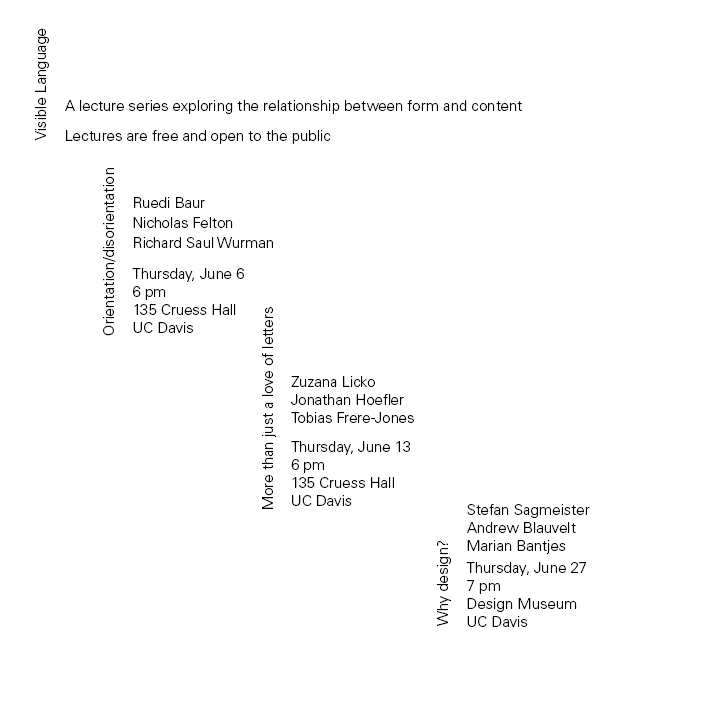
I designed a set of flyers for a mockup lecture series. The purpose of each poster was to present the important information from each event while catching the reader's attention. To draw the reader's attention to the title, I used spacing and various font sizes. At first I had issues with fitting all the content on a singular page. To fix this, I group different sections closer together and divided the other sections apart. The project taught me a lot about typographic hierarchy and how to present information.
Made in Adobe Indesign.
Valid HTML 5