Differences in Coding Websites between PC and Mobile
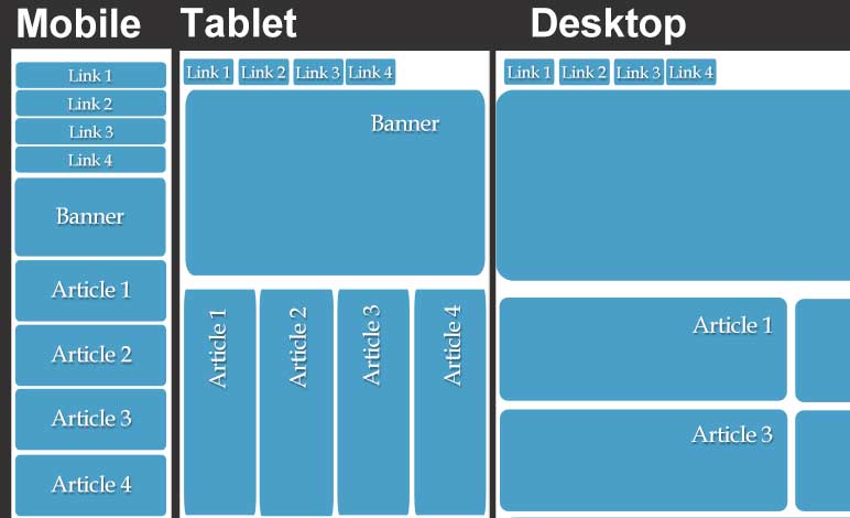
The display of websites on a computer versus a mobile phone are different due to the variation in screen size, layout, and fewer pixels. The phone also has touch input and slower processors. The phone’s screen is vertical thus requiring the navigation bar to be in a vertical layout and so on rather than the computer’s navigation bar being horizontal. To resolve issues relating to the differences, some web developers make two separate websites for each platform. Most developers use user-agent detection to redirect the user to the correlating website based on their user agent. However, it is not recommended to use this approach as you have to make two seperate pages for every page on the website. A solution to this is to add code to optimize the site for different devices. Setting the margins, max-width, float and positions with certain pixel sizes or left/right commands. It is also possible to change the width, margins, border-radius, padding, and max-height with percentages. Take notice of the viewport and density of display when inserting images. A third way is to create if statements for different screen sizes to style each device. An example is: [if screen resolution is lower than 960 px]. It’s important to create an IA (information assurance), set a viewport, and set a breakpoint for the width. Play with the width size of the website until it does not look correct in order to find the optimal size.
Read More
Mobile Input Types
Mobile input types are important for users to want to continue using your webpage based on the ease of completion. Different input types include: text, email, telephone number, number, password, date, date and time, month, and search. To utilize these input types, write input equal to a certain type of keyboard inside of your html document. The type of input should be changed for each different input desired. Based on the input type chosen, the keyboard will appear differently. If the input type is text, the keyboard appears normal. If the input type is email, the “@” and “.com” buttons will appear to make typing the address. If the input type is phone (aka “tel”), a numeric keypad appears. The input type for passwords will hide the characters the user had just entered. Using input types forces the user to use a specific keyboard. Within the code used for input, designers can implement autocorrect, autocapitalize, and autocomplete. For address lines, it’s a good practice to turn autocorrect off to prevent street names from changing to other words, without “dictionary intervention”. Autocapitalize will prevent the user’s mobile device from capitalizing the first letter, this is particularly useful for inputting an email address. Autocomplete, also known as word completion, will predict the user’s next words they will type. This is used for addresses and forms that typically use the same information. Having correct form types or mobile input types is most efficient for the user and relieves any annoyances caused by implementing the wrong keyboard.
Read More